Post 10. Can illustrations be as good as [or sometimes better than] photographs in visual journalism?

Often times, images along stories play the role of helping readers visualize a distant reality or part of the world. They help to express a mood, give a sense of place or to illustrate a scene. In formal storytelling settings, like news stories, for example, that illustrative role is generally reserved to photographs. Photojournalism has the ability of serving as documentation and is generally accepted as a more precise representation of reality. (Or, at least, generally accepted as a fair representation of a split second of reality.)

Illustrations, on the other hand, when used in journalism, generally serve the role of inviting readers to stop and read the stories. Often times, they are simply used as decoration. Except for illustrations in information graphics and diagrams — which generally look and feel like more technical drawings —, drawings are rarely used as descriptive storytelling tools in journalism.

But is there a moment in more objective, formal and literal storytelling, like journalism, when illustrations can fill in a more descriptive role? Would it be possible that illustrations could work as well or, in some ways, better than photographs, without looking like technical drawings?

To try to answer these questions, I will consider the examples of a photographs of Lima (2018) and the illustrations of Weiben (2015) representing the refugee crisis in the Greek Island of Lesbos.

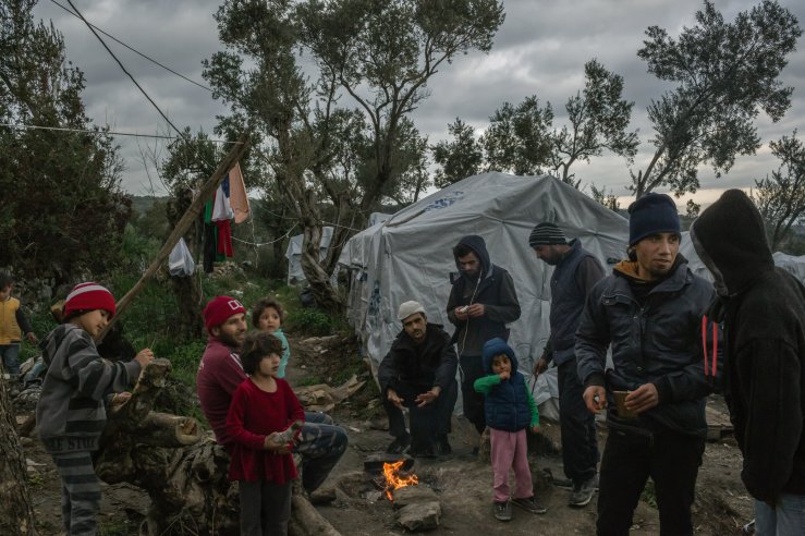
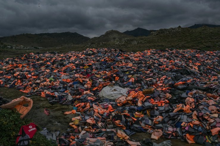
In the two photographs below, Lima shows a makeshift refugee camp (figure 1) and vests that refugees abandoned near the beach (figure 2), after leaving the boats that brought them to the Lesbos.

xxlesbos-slide-7PCV-superJumbo-v2
Figure 1: A Syrian family at a makeshift camp on the Greek island of Lesbos. Mauricio Lima for The New York Times (2018)
xxlesbos-slide-JZU3-superJumbo
Figure 2: Vests of refugees in Lebos. Mauricio Lima for The New York Times (2018)


Illustrator Peter Wieben set out to try to tell the refugee story with illustrations. Figures 3 and 4 show similar scenes to those seen on Lima’s photographs.

static1.squarespace-2
Figure 3. A refugee camp in Lesbos. Image by Wieben (2015).


static1.squarespace-1
Figure 4. Refugee vests by the beach. Image by Wieben (2015).

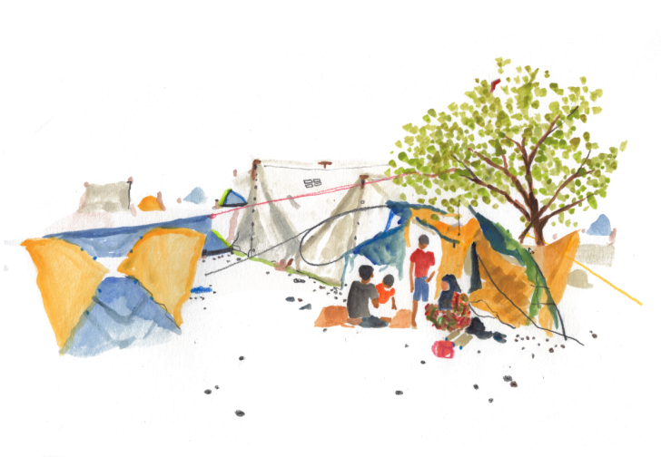
Wieben’s drawings were part of a series of sketches that he made while visiting Lesbos. He published the drawings on his website along a story that described the scenes, at the peak of the refugee crisis.

Lima’s photos are obviously a more literal representation of a millisecond of real life. But the photographer makes decisions on exposure time and shutter speed that control how light will be recorded. Lima’s use of light creates a moodiness that is often different of what can be seen by the human eye in the same location. To some extent, the photograph is not the actual representation of that moment, but Lima’s manipulation of it.

Wieben, on the other hand, abandons every attempt of capturing details of the scenes that he represents. His drawings capture the moments very differently from Lima’s photos. They give an idea of dimensions, colors and placement of objects. As a result, his final product is a not a manipulation of the moment, but an attempt to capture a mood and the artist’s perception of that moment.

My conclusion after observing Wieben’s work is that yes, illustration can, sometimes, work as well or maybe better than photographs to capture scenes when the mood is more important than details.

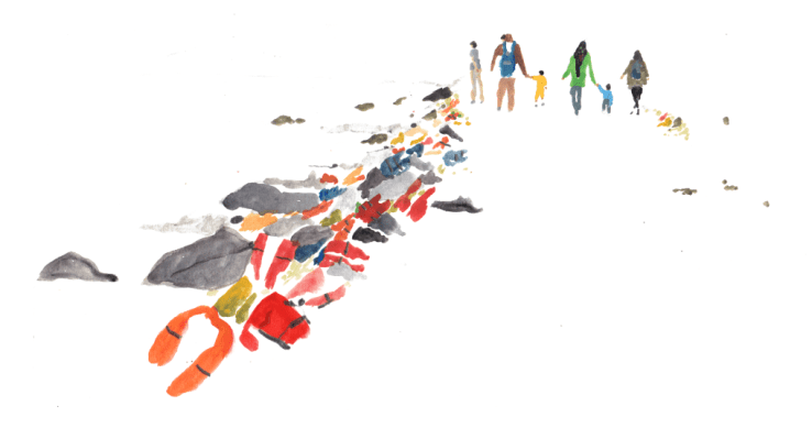
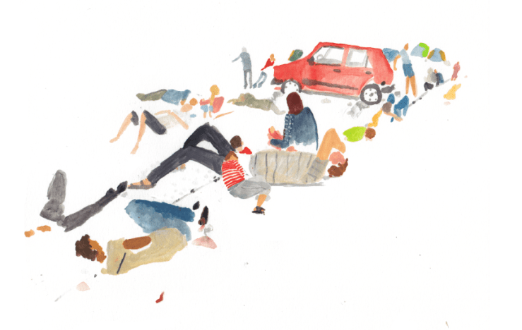
As a example, let’s consider the scene represented in figure 5, below. Wieben’s (2015) story described: ‘There are people sleeping everywhere … they are living rough on the streets, by the thousands. Men, women and children, sleeping in desperate circumstances, many with only cardboard to serve as bedding. There is no water, no bathrooms. No food.’

static1-squarespace-3.png
Figure 5. ‘People sleeping everywhere.‘ Image by Wieben (2015).


Weiben’s drawing proves that often it is not necessary to show hyperrealistic details to capture a scene. Sometimes, even part of a body is enough to transmit the impression of a human figure.

Illustrations are especially good way to capture intimate scenes, especially with children, who may be hard to photograph. Also, to communicate moments that otherwise might be excessively gruesome or hard to access with a camera. Figure 6, below, is an example of that. This is how Wieben (2015) describes the scene: ‘A girl of sixteen calls to her mother. Her little brother, seven, vomits after setting foot on Lesvos. As he stands his legs are shaking.’

static1.squarespace
Figure 6. A representation of a sick boy. Image by Wieben (2015).


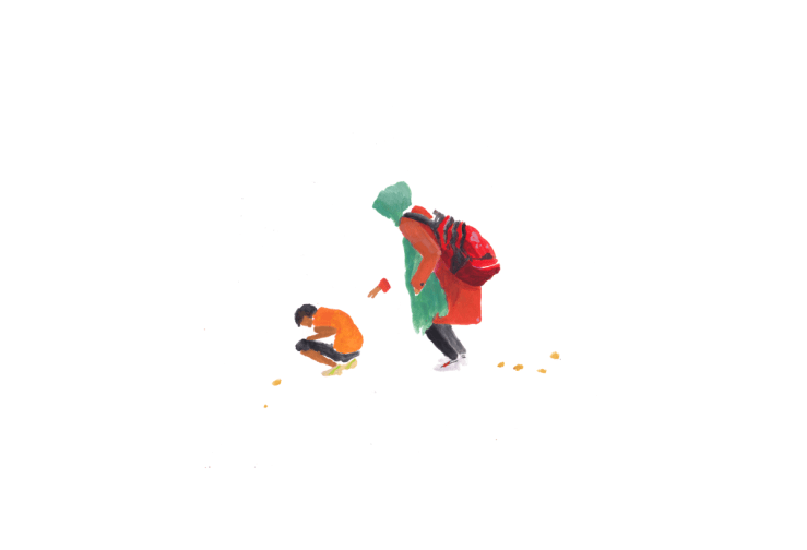
Figure 6 allows readers to focus on the drama of a sister trying to help her little brother, who is feeling sick after finishing his journey. There is no need for visual details of his illness and the precise identity of the boy doesn’t really matter in the context of this crisis. This is one moment, one drama.

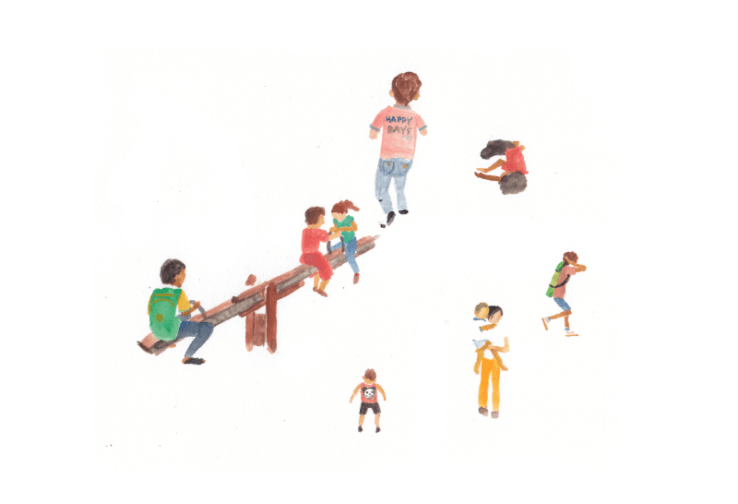
Drawings can transmit a mood that could be hard to capture in a photograph. On figure 7, below, Wieben sketched children playing near a makeshift refugee camp. ‘There are many children,’ Wieben (2018) wrote. ‘The children wander, sometimes finding playground equipment, sometimes inventing their own games.’

12
Refugee children playing in Lesbos. Image by Wieben (2015).


*

References:

LIMA, M. (2018) ‘Greece’s Island of Despair.’ The New York Times. [Online] March 29, 2018. Available from: https://www.nytimes.com/2018/03/29/world/europe/greece-lesbos-migrant-crisis-moria.html [Accessed on Nov. 17, 2018]

WIEBEL, P. (2015) ‘Children’s Island.’ Peterwieben.com. [Online] September, 2015. Available from: http://www.peterwieben.com/stories/#/lesvos/ [Accessed on Nov. 17, 2018]

Post 09. When does visual storytelling transcend into art?

Most of the work that I analyzed so far used illustration as a form of representation of reality, or functionally, as a way to communicate a story.

Artists like Christoph Niemann and Maira Kalman, examined in posts 01 and 02, often take a ludic and/or poetic approach to storytelling. They sometimes use sequences of images to convey a message. Other times, they mix words and images. But, in general, they are depicting a situation, describing a scene or capturing a mood, and trying to have a fairly high degree of control over how their message will be interpreted by the audience. For these reasons, I am grouping Niemann and Kalman in a category that I am calling “designer storytellers.” Figure one shows a conceptual piece by Niemann (2010), using descriptive labels.

Figure 1. A photo illustration by Niemann (2010).

On another side of the spectrum, there is the visual storytelling of artists like the British David Shrigley and the Spanish Joan Cornellà.

Shrigley and Cornellà employ many of the same visual narrative tools used by Kalman and Niemann, like sequences of images and a mix of words and images. But they differ in one key aspect: they often wave most of the control over how the message will be interpreted. They often choose to transmit a mood, instead of a clear message, and open a wide range of interpretations to their work. For this reason, I am grouping them as “artist storytellers.” Figure 2 is a sample of a sequential series of illustration depicting a surrealistic scene, by Cornellà (2010).

cornella1
Artwork by Cornellà (2018).


What are some of the elements that set apart the works of “designer storytellers” from the works of “artist storytellers”? What are the consequences of these approaches, in regards to how they make their living?

Art and functional mass communication are often intertwined and the distinction between art, graphic design and visual communication is often blurred. But there are a few pragmatic distinctions between them.

When artists like Cornellà give up control over how the message will be interpreted in favor of their self expression, is one of the critical differences between simple communication, satire or a cartoon and art. Another distinction is that the main goal of “designer storytellers” is to convey a message and to create a product for consumption. While artists give up some of the functionality and act under their own rules.

As a result, the choice for self expression may put artists at a greater financial risk than  storytellers who are targeting a particular audience.  While artists are trying to pass on a deeply personal feeling or interest, “designer storytellers” are ultimately trying to create a product for consumption.

cornella2
Figure 3. An image by Cornellà (2010).

Both designers and artists have advantages and disadvantages. The main advantage for the for designers is that they have a relatively more certain path to sustainability, since they are more focused on creating a product for market consumption. As for artists, there is greater financial risk, but also a somewhat greater changes that they will achieve more fulfillment through self-expression.

*

References:

CORNELLÀ, J. (2018) instagram.com/sirjoancornella. Untitled artwork. [Online] Available from: https://www.instagram.com/p/BjwhXVpjWo-/ [Accessed on Nov. 28, 2018.]

CORNELLÀ, J. (2018) instagram.com/sirjoancornella. Untitled artwork. [Online] Available from: https://www.instagram.com/p/BjBqcIVDv42/ [Accessed on Nov. 28, 2018.]

NIEMMAN, C. (2010) Christophniemann.com ‘I Lego N.Y.’ [Online] Available from: https://www.amazon.com/I-Lego-N-Y-Christoph-Niemann/dp/0810984903 [Accessed on Nov. 28, 2018.]

PEÇANHA, S. (2018) Sergio’s research & enquiry. ‘Post 01. Christoph Niemann — TED 2018, You are fluent in this language (and don’t even know it).’ [Online] Available from: https://sergio.video.blog/2018/10/16/post-01-christoph-niemann-ted-2018-you-are-fluent-in-this-language-and-dont-even-know-it/ [Accessed on Nov. 28, 2018.]

PEÇANHA, S. (2018) Sergio’s research & enquiry. ‘Post 02. Maira Kalman, The Illustrated Woman’ [Online] Available from: https://sergio.video.blog/2018/10/24/post-02-maira-kalman-the-illustrated-woman/ %5BAccessed on Nov. 28, 2018.]

Post 08. Reflections on my creative process — when I work for others.

In this post I will continue to dissect my creative process. But this time I will focus on when I work for others. I will concentrate on a recent assignment that I did for The New York Times, for a series of news stories about how China became a superpower, called China Rules (Pan et al, 2018). The stories published November 18 online and a week later in print. 

In this case, the creative process started with a briefing from word editors that were working on the narratives. They described to me what the stories would be about. My task was to help create a coherent visual identity between the different stories.

The first thing that I needed to get started was to read the story drafts. Or, at the least, I needed to have a very detailed description of each story. This is the first key difference from my personal work, which starts with observation and no need of words.

The second step was thinking/creating/solving the problem of identity. That is when I had the idea of ​​creating a family of icons, which then evolved into a series of illustrations.

The third step is actually representation/drawing. This phase coincides with the personal work that I presented in the previous post: Walking like a New Yorker. Figure 1 below has several initial sketches.

bear-lion
Figure 1. Initial sketches for China Rules (Pecanha, 2018).


dragon-bird
Figure 2: Dragon and Birdcage (Peçanha, 2018)

The fourth step is showing my sketches to my editors, designers and other people working on the series. At this point, my work is subject to a editorial filter. Depictions of panda bears and dragons were considered inappropriate. 

rejected
Figures 3 and 4. Samples of rejected illustrations (Peçanha, 2018)

The fifth step is improving the illustrations. according to the editorial filter. To improve it, I work directly with the titles of the stories. It helps me match the illustrations to the words, as seen in figure 5, below.

bird-website
Figure 5: Final product, headline associated with illustration. (Peçanha, 2018)


The sixth and final step of the creative process is publishing. Figure 5 shows how one of the illustration appears on The New York Times website.


Conclusions:

  • The project on China Rules began in May 2018. However, it was interrupted for a few months. Several stories were reworked and, as a result, many drawings had to be redone in the week before publication.
  • In this particular case (work), the illustration is more functional than when I work for myself, where it can be a sort of personal expression.
  • The great takeaway, for me, reinforces the words of the American cartoonist Jeff MacNelly, that the best thing for his creative process was a deadline (Adelman, 1991).
  • A key takeaway for me is that I will become more productive if I create a mechanism that mimics the strict deadlines that I get from clients when I am working for myself.

*

References:

ADELMAN, K. (1991) ‘Quick Draw.’ The Washingtonian. [Online] May 1991. Available at: https://www.washingtonian.com/2015/06/12/jeff-macnelly-interview/ [Accessed on Dec. 5, 2018.]

PAN, P. et al (2018) ‘China Rules.’ The New York Times. [Online] Nov. 18, 2018. Available from: https://www.nytimes.com/interactive/2018/11/18/world/asia/china-rules.html [Accessed Nov. 20, 2018]

PEÇANHA, S. (2018) Illustrations for ‘China Rules.’ Unpublished.

PEÇANHA, S. (2018) Illustrations for ‘China Rules.’ The New York Times. [Online] Nov. 18, 2018. Available from: https://www.nytimes.com/interactive/2018/11/25/world/asia/china-freedoms-control.html  [Accessed Nov. 20, 2018]

Post 07. Reflection on my creative process — when I work for myself.

The American cartoonist Jeff MacNelly used to say that the best thing for his creative process is a deadline (Adelman, 1991). A fixed due date is definitely an accelerator for any creativity, including mine. Working in a newspaper, as I do, demands a compromise with time. The time pressure could add another layer of the agony that I feel between the assignment and the final product.

In the past three months, I have been doing more illustrations, at work and for myself, in an attempt of exploring and documenting what I see in the world. As inspiration can be triggered anywhere, I have been more conscious of my surroundings and of others, and have been carrying a sketchbook with me.

After analyzing the work of so many illustrators, I decided to take some time to reflect about my own creative process. I will divide this reflection in the next two posts. The first (this one), will talk about works that I did for myself. In the second post I will talk about the work for my job.

A key difference is that when I work for myself there are no set deadlines. It is just a flaneur, a stroller in New York city, experiencing and observing the city where I live. As for work, the world is vastly different, with deadlines and editors on my neck — I will discuss that in my next post.

On my personal projects, my creative development starts with observation/perception of the behavior of certain groups and their daily lives; of landscapes that call my attention; of how people interact. I am a sort of sociologist documenting people and their behavior with sketches.

Adler (1928) has contributed to my comprehension of myself and my work, specially during my observation phase.

‘The psychic life of man is determined by his goal. No human being can think, feel, will, dream, without all these activities being determined, continued, modified and directed, toward an ever-present objective. This results, of itself, from the necessity of the organism to adapt itself and respond to the environment.’, (Adler 1928, p.20).

Observation is seminal to my drawings. Figures 1and 2, below, illustrate my observation phase. I took these photographs while observing how New Yorkers walk, for a short visual story that I am calling Walking like a New Yorker’. The story will illustrate some skills that every New Yorker knows, and that help to make more manageable in the overcrowded city.

As the Spanish painter Pablo Picasso said, ‘to know what you’re going to draw, you have to begin drawing’ (Harrison, 2014). So, the second step in my creative process is to actually draw. Figure 3, below, shows a few samples of my sketches for ‘Walking Like a New Yorker’.

3086_001
Figure 3. Sketches of New York City Scenes. Peçanha (2018).

The third part of my creative process is getting some critical feedback from someone I trust. On personal projects, normally the victim is my wife. By doing that, I pay attention to her expression and reactions. If I see a smile, I know that I am probably going in the right direction. When I noticed that she doesn’t understand, I might make adjustments.

The next part is finishing the drawings. The duration of this fraction, depends basically on the deadline that I have. And the fifth part is publishing.

After this closer revision of my creative process, I came to the conclusion that:

  • When I am working on personal projects, I tend to stop in the third part of it (sharing/showing). The project used as an example for this post is paused on the sketch step;
  • Personal projects tend to happen considerably slower than professional ones; 
  • Without a deadline, I am likely to procrastinate;
  • With this in mind, I noticed that a deadline is a fundamental difference between my personal projects and those that I do for my job; I come full circle to MacNelly’s observation. Without a deadline, the sketches could lose themselves.
  • Even when working in personal projects that are not initially planned  for publication, there is a need of a deadline as a strategy to accomplish my goals.


*

References:

ADELMAN, K. (1991) ‘Quick Draw.’ The Washingtonian. [Online] May 1991. Available at: https://www.washingtonian.com/2015/06/12/jeff-macnelly-interview/ [Accessed on Dec. 5, 2018.]

ADLER, A. (1928) Understanding Human Nature. London:Inprint (Reprint of first edition by Martino Fine Books.)

HARRISON, S. (2014) Aiga Eye on Desigin. [Online] Dec. 31st, 2014. Available at: https://eyeondesign.aiga.org/pablo-picasso-design-quote-you-have-to-begin-drawing/ [Accessed Nov. 15, 2018.]

PEÇANHA, S. (2018) Sketches and reference photographs for Walking Like a New Yorker. Unpublished.

Post 06. How picture books work?

Synergy is a word that could be described as ‘cooperative interaction’ (Google Dictionary, 2018). It is often used in dual relationships that require some level of joint effort.  Sipe (1998) made me think about synergy as in the way words and illustrations relate to each other. Not only in the picture books that I have been reading with a more critical eye, but regards to the synergist relationship of words and images in my own work.

Sipe took a semiotic approach of transmediation to describe how the coexistence of words and illustrations on the same environment (like the page of a book, for example) can alter the interpretation of both text and images. To Sipe, ‘transmediation makes it clear that visual texts are on equal footing with verbal text’ (Sipe, 1998, p. 107), in regards to how they alter our understanding of the message. The reader acts as a co-creator of the story and creates the synergy between image and text through the filter of subjectivity. 

This whole theoretical approach on the relation between words and pictures was new to me. I found it interesting and helpful to my work to be aware of the readers role in recreating the story as they read words and images. Subjectivity also plays a fundamental role here. Sipe’s paper reinforces and gives a theoretical basis to what I had only understood in practice.

At the beginning of the semester, I created a collage that played with the relation between words words and very basic shapes (Figure 1, below).

sol-final-text copy
Figure 1: Paper challenge, Peçanha (2018).


Sipe’s semiotic interpretation is a useful tool to help explain the mechanisms that make the game between pictures and a text work in Figure 1.

The very basic shapes — red circles against a rectangular background that changes colors — allow a wide range of subjective interpretations. The presence of the words a slight change in the position of the elements has the potential to completely alter the message. The story is told not through the pictures, neither through the words. But somewhere within their synergic relationship.

As a professional, this theoretical awareness enriches my repertoire and empowers me to make more conscious decisions in future projects.

*

References:

Google Dictionary. (2018) [Online] Available from: http://www.google.com [Accessed on Dec. 11, 2018.]

PEÇANHA, S. (2018) Paper challenge. Unpublished.

SIPE, L. R. (1998) ‘How Picture Books Work: A Semiotically Framed Theory of Text-Picture Relationships.’ Children’s Literature in Education. Vol. 29, No. 2 p. 97-108.

Post 05. What makes David Shrigley so productive?

I was drawn to examine the work of the British artist David Shrigley for the quality and wit of his art, but also for his productivity. Shrigley is one of the most prolific authors of picture books for adults today. His work also includes paintings, cartoons, sculpture, photography and music. Analyzing some of his methods offered me useful lessons about how an artist can become so productive.

newr-36
Figure 1. A sketchbook-like drawing by David Shrigley.

In many ways, Shrigley’s work looks and feels like sketches. On one hand, he cherishes the kind of rudimentary drawing that emerges in most of us naturally, before any art education. On another hand, the sketch appearance is a reflection and a consequence of his approach: Shrigley doesn’t spend much time refining or redoing his drawings.

On a video interview with Louisiana Channel (2016), Shrigley talked about the importance of producing more more work than he actually intends to publish. ‘Thirty or forty percent of it is retained and then the other 60 or 70 percent is thrown away,’ he said. The work is finalized mostly during the editing process.

really-good
Figure 6. Really Good, 4th Plinth Commission, by David Shrigley. Image from DavidShrigley.com

Producing in more work than he plans to use allows his ideas to flow. To him, the excess work sets him free. ‘Because you always feel that the chances are the drawing your making at a particular time … is probably going to end up in the garbage, so that sets you free to do whatever you like and don’t worry about it,’ he said.

This is a different approach from what is taken by other relevant artists, like Christoph Niemann, for example. In TED2018 You are fluent in this language (and don’t even know it) (2018), Niemann said that his process starts with a concept. After defining a concept, he uses a range of styles to finish and convey the idea. Niemann’s approach is often similar to that of  a graphic designer. Shrigley’s approach, on the other hand, is more similar to those of other cartoonists.

During the Louisiana Channel (2016) interview, Shrigley also described two techniques he often uses, that could help increase his productivity.  One of them is to create lists of things that he wants to draw. He draws first and adds words later. Another technique is the opposite way: words first, drawings later. ‘I’m trying to make drawings that don’t illustrate text and text that doesn’t describe the image,’ he said.

cant-wait-to-hatch-really-looking-forward-to-it-m-wand
Figure 7. A painting by David Shrigley, with words loosely related to the drawing.

Based on his interview and on an analysis of his work, we can determine a number of factors contributing to Shrigley’s productivity: 1. The simplicity of his drawing style. 2. The looseness of the way he works, planning to produce more artwork than what he intends to publish. 3. His methodical approach, like the lists that he creates of things that he wants to draw. And 4. his regimented work hours. He says that whether he is inspired or not, he will put himself to work. ‘If you put the hours in, the work will make itself. That’s my experience of it anyway. If you don’t put the hours in, the work is much more difficult,’ Shrigley said.


References:

LOUISIANA CHANNEL (2016) David Shrigley Interview: Everything That is Bad About Art [Online video] Aug. 20, 2016. Available from: https://www.youtube.com/watch?v=24rovlfXqo4 [Accessed 6 November 2018].

SELF, Will (2013) David Shrigley: ‘I gave my book out at the pub – that’s how it all started’. The Guardian. [online] 18 Oct. 2013. Available from: https://www.theguardian.com/artanddesign/2013/oct/18/david-shrigley-book-pub-started [Accessed on Oct. 30, 2018].

SHRIGLEY, D. (2018) David Shrigley – Artist. 197cm tall. [Online] Available at http://davidshrigley.com/ [Accessed on Oct. 30, 2018].

SHRIGLEY, D. (2018) Fully Coherent Plan: For a New and Better Society. Edinburgh: Canongate Books.

SHRIGLEY, D. (2011) What the hell are you doing? The essential David Shrigley. New York: Norton, W. W. & Company, Inc.


Post 04. How to travel to a magical world?

In my previous post, I looked into Arizpe, E. & Styles, M. (2002) study about how children interpret picture books. The authors concluded that children are able to decode clues like surrealism, visual jokes, multiple meanings and inconclusive endings early in life. With this in mind, I went on to analyze ‘Where the wild things are’, Sendak (1963).  I wanted to understand some of the storytelling tools Sendak used.

Sendak’s iconic story takes us on a trip through a child’s imagination. The main character is a boy called Max, who is playing around the house dressed like a ‘wild thing.’ After misbehaving, he is sent to his bedroom for the night, without super. But his adventures continue in the bedroom, that becomes a parallel world, where wild things live. 

sendak-cover
Figure 1. The cover of Maurice Sendak’s Where the Wild Things Are (1963).


The story begins with literal representations of a child playing around the house (figure 2.), with elements like a costume, a hammer, blankets, books and a stuffed animal.

sendak-playing-literal
Figure 2. Literal representation in Sendak’s book.


But after Max is sent to his bedroom after he misbehaves. In his room, the world starts a magical transformation. This transformation is a key moment in the story and is an essential tool that Sendak uses to guide readers through the journey.

sendak-bedroom1
Figure 3. Bedroom transformation, Sendak M. (1963)


With no given reason, trees start to grow in Max’s room. Sendak uses a brief series of drawings (figures 3 and 4) and 27 words to progressively transform his character’s environment.

‘That very night in Max’s room a forest grew and grew — and grew until his ceiling hung with vines and the walls became the world all around’ (Sendak, 1963)

Max starts to interact with the magical world as the transformation happens, helping it all to seem more natural, and giving readers another element to help make the transition seamless (figure 4).

sendak-bedroom2

Figure 4. Bedroom transformation, Sendak M. (1963)

From this point on, Sendak progressively abandons literal representations in the story. Max’s character dives into the magical world that he created in his mind and where most of the story takes place. This is how readers are moved to the world where the ‘wild things’ live.

sendak-playing
Figure 5. Wild things swinging.


Based on this analysis, we can conclude that it is the progressive visual transition, reinforced by words and actions within the story what allow the surrealism to make sense. The transformation is communicated through a mix of images and words. In addition, Max, the main character, interacts in a natural manner with the magical environment. His interaction reinforces the naturalness of the magic taking place and allows readers to go along in his visit to the place where the wild things are.

*

References:

ARIZPE, E. and STYLES, M. (2002) ‘¿Cómo se lee una imagen? El desarrollo de la capacidad visual y la lectura mediante libros ilustrad.’ Lectura y Vida, 23(3). Available from: http://eprints.gla.ac.uk/50859/ [Accessed: Oct. 27, 2018]

SENDAK, M. (1963) Where the Wild Things Are. New York: HarperCollins; 1 edition (1984). 

Post 03. How children read picture books?

How do children perceive illustrated books? How do they react to the interaction of words and images? How much of the message are they capable of absorbing? How do we learn how to see and to extract meaning from the visuals?

Arizpe, E. & Styles, M. (2002) tried to answer these and other questions about how children ages 4 to 11 interpreted picture books. They analyzed the reactions of 126 children to two books. They found that picture books increase the joy and the motivation during the learning process and were surprised by how much children were capable of extracting meaningful messages from the visuals.

The children in the study were capable of noting and decoding challenges like surrealism, intertextuality, suggestive games, multiple meanings and inconclusive endings. They understood colors, lines, design, metaphors and visual jokes. The children in the study had different reading levels. But, in general, all were capable of identifying complex clues, including social and moral aspects of the stories.

It was a positive surprise for me to learn that the answer to all those questions about how much children take away from picture books is, in short, a whole lot. I was unaware of how early we start to develop our cognitive capacity and of how soon they become pretty advanced.

In this context, it is easy to understand how visual books have become an essential tool for education during our early years. It is, in fact, pretty obvious why we acquire advanced visual interpretation skills so early in life.

As soon as we are born, we learn to identify our environment and closest relatives through visuals, sounds and smells. We start to build up our visual repertoire and to react to visual clues before we learn who we are, where we are and who we are with. Like when babies smile if they see their parents.

In the same way, we begin to learn how to attribute and extract meaning from visuals years before we acquire verbalization skills. It is interesting that so many of us lose those skills as we grow up, and raises questions about why that happens.

*

References:

ARIZPE, E. and STYLES, M. (2002) ‘¿Cómo se lee una imagen? El desarrollo de la capacidad visual y la lectura mediante libros ilustrad.’ Lectura y Vida, 23(3). Available from: http://eprints.gla.ac.uk/50859/ [Accessed: Oct. 27, 2018]

Post 02. Maira Kalman, The Illustrated Woman

One of the most widely recognized authors of  picture books for adults is the Israeli-born American illustrator Maira Kalman. During the course of this masters program I will  examine her work and try to get a better understanding of the tools she uses to create the poetic feeling in her stories.

Kalman wanted to be a writer. But shortly after finishing college, she realized that she was unhappy with the quality of her writing and decided that she would be better off if became an illustrator. Now, after a dozen of children books  and a couple of years as a visual columnist at the New York Times, her naive style has become famous around the world.

In TED2007 The Illustrated Woman (2007), Kalman talks about her approach to storytelling. ‘I don’t think differently for children than I do for adults. I try to use the same kind of imagination, the same kind of whimsy, the same kind of love of language,’ she said.

‘So, in writing for children, it seems simple, and it is. You have to condense a story into 32 pages, usually,’ Kalman said. ‘And what you have to do is, you really have to edit down to what you want to say. And hopefully, you’re not talking down to kids and you’re not talking in such a way that you, you know, couldn’t stand reading it after one time.’ Figures 1 to 4 show some of Kalman’s illustrated books targeting children. 


Her handwriting also helped to set her style apart. Figures 5 and 6 are some of Kalman’s work for adults. She applies in her books for adults the same naive style that she uses in her work for children. But she added a lot more words to it. Here are some samples of her work directed to adults in her column at THE NEW YORK TIMES, And the Pursuit of Happiness.


1209Kalman9b
Figure 5. An illustration from one of Kalman’s works targeting an adult audience.
1209Kalman12d
Figure 6. An illustration for ‘And the pursuit of happiness‘, Dec. 31, 2009, by Maira Kalman for The New York Times


Kalman also played with taking photographs and sometimes writing or drawing on top of them. ‘The books are really journals of my life. I never — I don’t like plots. I don’t know what a plot means,’ Kalman said in her talk.

‘I can’t stand the idea of anything that starts in the beginning, you know, beginning, middle and end,’ Kaman said. ‘It really scares me, because my life is too random and too confused, and I enjoy it that way.’

In TEDxMet: Icons – Maira Kalman (2013), Kalman gave yet another important insight to her approach to making picture books. ‘I was doing things that were narrative and naive because I thought: “this is my way to write. I’m going to write by painting.’’

The mix of a naive illustration style with stories that often appear to be non sequitur help to make many of Kalman’s adult picture books feel approachable and serendipitous. Part of her charm is that her stories sometimes feel like poetic annotations, but ultimately don’t seem to intend to be much more than her personal visual diary.

*

References:

KALMAN, M. (2009) By George. [Online] Dec. 31, 2009. Available from:  https://kalman.blogs.nytimes.com/ [Accessed 23 October 2018]

TED2007, IDEAS WORTH SPREADING (2007) The illustrated woman [Online video] March 2007. Available from: https://www.ted.com/talks/maira_kalman_the_illustrated_woman %5BAccessed 23 October 2018]

TEDX (2013) TEDxMet: Icons – Maira Kalman [Online video] Oct. 19 2013. Available from: https://www.ted.com/talks/christoph_niemann_you_are_fluent_in_this_language_and_don_t_even_know_it [Accessed 23 October 2018]


Post 01. Christoph Niemann — TED 2018, You are fluent in this language (and don’t even know it).

One of my goals in my research program is to try to identify some if the mechanisms that can make pictures book witty or poetic. The works of illustrators Maira Kalman and Christoph Niemann contain many of the mechanisms that I am interested in decoding.

Niemann, a German illustrator and graphic designer, explained elegantly on a TED talk the mechanisms that he tries to activate during in his process of creating images.

On TED2018 You are fluent in this language (and don’t even know it) (2018), Niemann said  that one of his most important techniques to create images is to use negative space and leave unexpected voids. ‘The idea is, that instead of drawing the actual object, you draw the space around it,’ he said.


To show that concept, Niemann used an example of two AA batteries placed side by side in landscape that he drew.

christophniemann-owl

‘What we see here is not a owl flying. What we actually see is a pair of AA batteries standing on a nonsensical drawing,and I animate the scene by moving my desk lamp up and down. The image really only exists in your mind. So, how much information do we need to trigger such an image? My goal as an artist is to use the smallest amount possible.’

Niemann added that his favorite tool as an artist is abstraction. He developed a concept he called the abstract-o-meter, to find  the right level of abstraction. On one side of the scale, it’s too simplistic that nobody understand anything. On the other, it is too realistic that it leaves little room for interpretation.

christophniemann-abstractometer

Finding the right balance between realistic and a figurative allows him for totally new angles in storytelling. ‘As a designer, it’s absolutely key to have a good understanding of the visual and cultural vocabulary of your audience,’ Niemann said.

Niemann said that his goal is to create an aha moment for the reader. ‘What I want to do is not show a realistic scene. But, maybe like poetry, make you aware that you already had this image with you, but only now I’ve unearthed it and made you realize that you were carrying it with you all along.’

christophniemann-shaving

Niemann believes that the most important skill for an artist is really empathy, more so than craft and creativity. ‘You need to step back and look at what you’ve done from the perspective of the reader,’ he said.

To Niemann, the magic happens when readers interact with the image. When they can read it, understand it, question it, are bothered, bored or inspired by it. This interaction turns the artist’s work into a creative dialogue. 

‘The great lesson there was that the real magic doesn’t happen on paper. It happens in the mind of the viewer,’ Niemann said.

Niemann intentionally leaves gaps in his stories, that he calls ‘negative space’. His goal is to give just enough information to allow readers to fill these gaps and complete the stories with their own experiences. This participation allow readers to come out of the experience with a feeling of ownership. Above all, readers feel rewarded by the smile that is activated when they are capable of filling in that negative space.

Niemann’s insight acknowledges the active role that readers play the storytelling. It emphasizes that storytellers should try to be as aware as possible of the kinds of associations that readers might make when seeing a sequence of images or a mix of words and pictures. At the same time, it welcomes the unavoidable fact that readers will come up with their own conclusions.

*

References:

TED2018, IDEAS WORTH SPREADING (2018) You are fluent in this language (and don’t even know it) [Online video] April 2018. Available from: https://www.ted.com/talks/christoph_niemann_you_are_fluent_in_this_language_and_don_t_even_know_it [Accessed 20 October 2018]